 Clear Space
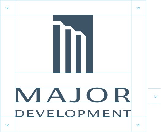
The isolation zone or clear space for a logo refers to the minimum amount of space that should be left around the logo to ensure that it remains legible, unobstructed and visually distinct. This area should be free of any other design elements, text, images, or graphics.The size of the isolation zone is typically proportional to the height or width of the logo and varies depending on the specific design and brand guidelines. As a general rule of thumb, the isolation zone should be at least equal to the x-height or half of the width of the logo.
The minimum size for a logo depends on the complexity of the design, the thickness of the lines, and the legibility of the text. In general, a logo should be large enough to be easily recognizable and legible in various applications, such as print, web, or mobile devices.
As a general rule of thumb, a logo should not be smaller than 1 inch in width or 72 pixels in height. However, this is just a guideline and can vary depending on the specific design and brand guidelines.
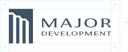
The isolation zone or clear space for a logo refers to the minimum amount of space that should be left around the logo to ensure that it remains legible, unobstructed and visually distinct. This area should be free of any other design elements, text, images, or graphics.The size of the isolation zone is typically proportional to the height or width of the logo and varies depending on the specific design and brand guidelines. As a general rule of thumb, the isolation zone should be at least equal to the x-height or half of the width of the logo.

The minimum size for a logo depends on the complexity of the design, the thickness of the lines, and the legibility of the text. In general, a logo should be large enough to be easily recognizable and legible in various applications, such as print, web, or mobile devices.
As a general rule of thumb, a logo should not be smaller than 1 inch in width or 72 pixels in height. However, this is just a guideline and can vary depending on the specific design and brand guidelines.
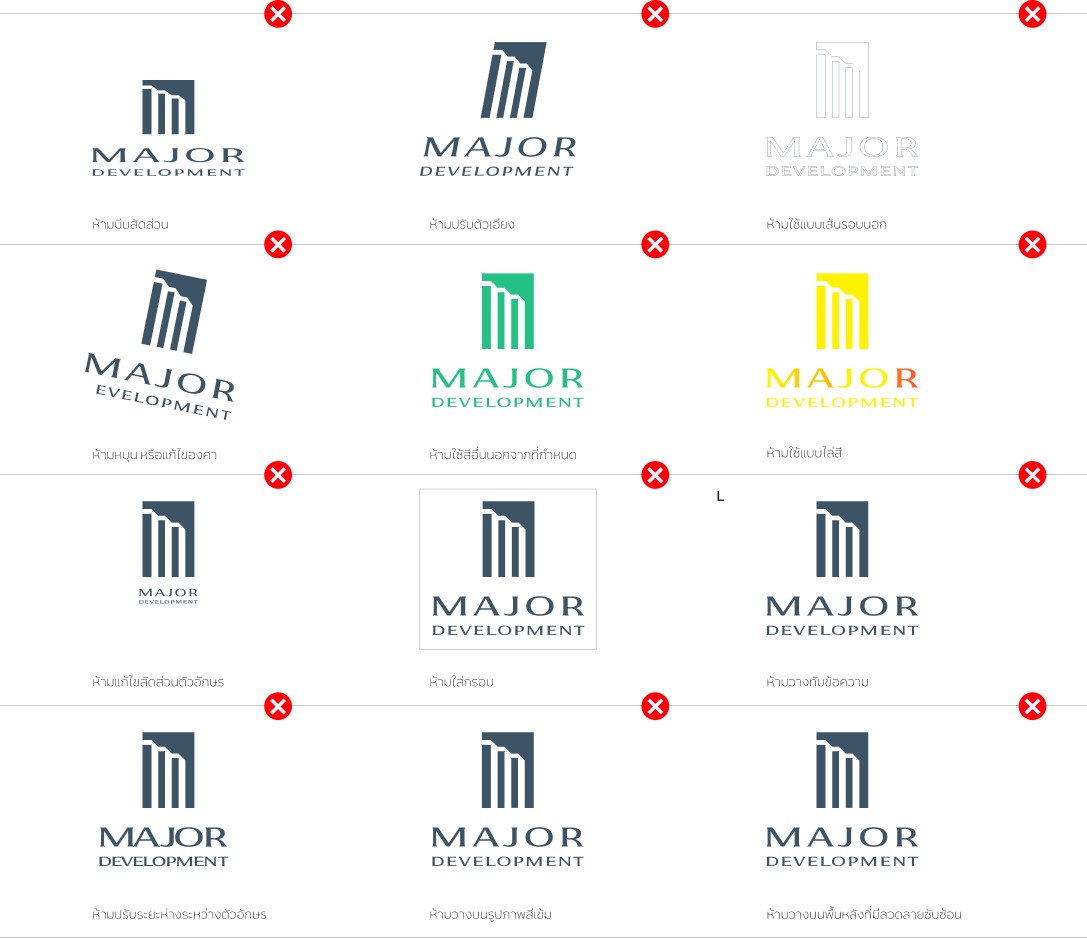
Using a logo incorrectly can have negative consequences for a brand, as it can damage the brand's reputation and create confusion among consumers. Here are some examples of incorrect logo usage:
Staff will contact you during business hours 09:30 - 18:30